You cannot judge a book by it’s cover, but you can certainly judge a website by it’s design.
Web Design has progressed immensely throughout the years.
New features are always being discovered and added to the list of options for creators to use.
Infinite scrolling, banners, pop-ups, cookies, social media integration, comments – the list goes on.
With so many choices it can be difficult to determine which additions will work best for your pages.
Do not fear!
These five website design trends in 2017 are a sure-fire way to amp up your website.
2016 was a year for clarity.
2017 is the year for improvement.
Last year, we saw some modern trends become the established leaders in website design.
First and foremost, there was a huge focus on home pages.
This should come as no surprise, considering that most users get a first impression about your business through your home page.
Everyone wants to make a great first impression.Click To Tweet
There’s a large consensus throughout the digital marketing community that home pages need to portray an accurate depiction of your company branding.
Having an attractive home page is essential to keeping users interested in your brand and on your website.
Speaking of home pages, most of them were created using flat design.
2016 was a year for minimalism.
Flat design was used across all the great websites because companies wanted a clean and sleek web design.
Something simple, but powerful.
High definition photography was another element the digital world demanded.
With smartphones equipped with cameras equivalent to DSLRs, brands had no excuse for poor quality photos.
As the year for improvement, 2017 has booted out and added on to some of these trends.
For your best bets, here are five web design trends in 2017 every designer should follow.
1. Geometric Design is the Design of the Future
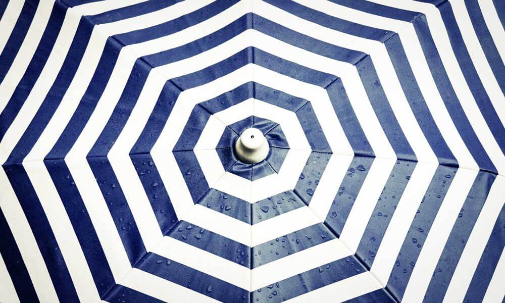
While the flat design is making its dramatic exit, geometric design is making a grand entrance.
Flat design was so prevalent across the web in 2016 that website’s ended up looking a little too similar.
Instead of being recognised as a trendy way to style your site, the flat design looked more like a template instead of a valid creative choice.
That is why in 2017, geometric patterns, shapes, texts and lines are making their way to the top of this list.
More and more websites are using hexagons, rhombuses and squares to create patterns across their sites.
Since the utilisation of these shapes is harder to replicate, every combination comes out looking unique.
This is particularly the case for many digital agencies.
The use of geometric features across their home pages makes their aesthetic branding very distinctive.
Integrate these shapes into your website slowly and see what patterns work best for your brand.
2. Be Animated!
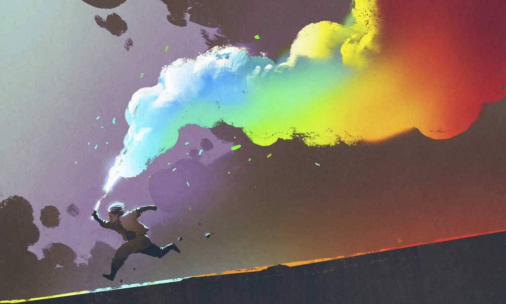
If high definition photos are the standard, the next level includes integrating gifs, videos and animations to your website.
Not only do they help you giggle during the long workday, but they also enrich your layout as well!
These tidbits make great contrasting elements with the existing content on your page.
When selected properly, they are also great supportive elements.
If your brand prefers to take a more subtle approach to animations, soft animations are the way to go (this is when websites seamlessly transition to the next idea during scrolling).
The goal is to integrate your next point with the previous one effortlessly.
2016 was the start of these new creative features.
Users will no longer settle for choppy transitions or default effects.
As an informed web designer, these animation decisions should be discussed at the beginning of your design journey.
3. Simple Navigation Helps the User and the Business
One of the most significant design trends to follow in 2017, simple navigation coupled with a fast load time means a happy user and a happy you.
According to SmartInsights, users spend about 71% of their time on mobile devices, which means that people want information at the speed of light.
They do not want information later; they want it now.
When someone comes across your brand, the immediacy of information is vital.
What you want to do here is to shorten their journey.
Keep navigation to 5 items or less to make things simple.Click To Tweet
This will not only help your users stay on task when finding what they were looking for but shortening your navigation will also help with your load time!
Fewer pages mean a faster load time.
Also, as we covered earlier, a faster load time means a happy user.
So let’s spread the happiness!
4. Who Says Old School and New School cannot Hang?
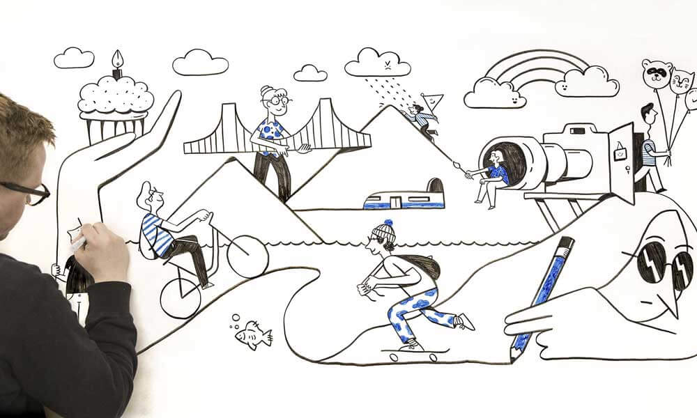
One of the best touches a website can have is something hand drawn.
Seeing a silly stick figure or doodle on a website can bring it home for a brand because hand drawn elements are fun ways of bringing the old school into the new school.
They give off a positive and nostalgic feeling for the times before everything was digital.
Including hand drawn icons, logos, symbols, pictures and graphs are also great ways to deviate from the norm on digital platforms.
Even better, hand drawn images give your site a little more personality.
Users feel closer to something that has been sketched out because it feels rawer.
Get in touch with your inner kid and make something simple to start off.
For those who are more artistically gifted with a pen and paper, try redrawing your logo design.
Some brands that are known for including hand drawn elements into their marketing strategies are Chipotle and Starbucks.
Chipotle regularly has hand drawn elements all over their to-go bags, and they even have handwritten content in Spanish!
As for Starbucks, I am sure you are all familiar with their holiday cups.
For example, this past December they featured artists across the globe who wanted to personalise the coffee cups.
The results?
It added a beautiful touch to the sipping experience.
5. Many Faces, Typefaces to be Exact!
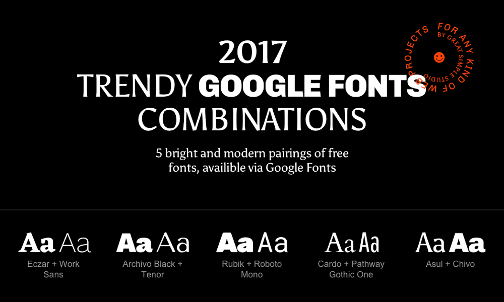
Typography has become one of the major key elements in website design.
We see standard types like Arial, Times New Roman and Helvetica getting an upgrade for new and improved fonts.
Typefaces are now very reflective of the brand and website on which they live.
They change colours depending on a user’s scroll, have animations, and are integrated with page effects.
Whether your company is #TeamSerif or #TeamSanSerif, experiment with new typographic choices for 2017.
Concluding our website design trends in 2017
These five website design trends in 2017 are sure to set your business on the right path for the rest of the year.
Let’s see them again:
Out with the minimal and in with the geometric! You may not have taken a photography class, but you can make it seem like you did. Add gifs and animations to your website to keep it trending in 2017. Simple navigation + less load time = happy user. We like happy users. Hand drawn details will make your website come across as more personal to your users. Experiment with typography to give your website some extra oomph.
Author Bio – Therese is a writer for Aumcore, Digital marketing agency that doubles as a Responsive Web Design Firm, and specialises in Mobile User Experience Design.
If you wish to discuss how we can develop your brand or provide graphic design for your product or business, email us at: hello@inkbotdesign.com
Inkbot Design is a Creative Branding Agency that is passionate about effective Graphic Design, Brand Identity, Logos and Web Design.
T: @inkbotdesign F: /inkbotdesign
The post 5 Website Design Trends in 2017 Every Designer Should Follow is by Stuart and appeared first on Inkbot Design.
Comments
Post a Comment